Packaging design is the discipline of engineering a physical container that communicates a brand, protects a product, and adapts to a sales channel. WITPAX has manufactured packaging for global brands since 1996, building both the design language and the production stack that bring that language to shelf or doorstep. This guide maps nine aesthetic styles—from minimalism to maximalism, from retro-futurism to biophilic—and five strategic frameworks—DTC, frustration-free, retail-shelf, subscription, and luxury—and shows how to combine them into a packaging design approach for your product.
The guide is built for a single decision: how should your product look, open, and ship. Every section gives you a working answer, not a survey of options.
What is a packaging design brief and why do you need one?
A packaging design brief is a written specification that translates a product’s commercial goal into measurable design constraints—target audience, sales channel, brand assets, regulatory zone, and unit-cost ceiling. It prevents subjective design debates and aligns vendors before any visual work begins.
The brief is the document every later decision points back to. Without it, design discussions slide into taste arguments. With it, every choice—color, material, finish, structure—has a written reason.
A working brief covers five fields:
- Audience: who buys this product, where they shop, what they already own from the category, and what visual codes they read as “premium” or “trustworthy.”
- Sales channel: retail shelf, e-commerce, Amazon FBA, subscription, or wholesale. Each channel changes the design rules. A package that wins a Sephora shelf often fails as an Amazon FBA unit.
- Brand assets: logo vector files, Pantone or CMYK color values, typography licenses, voice guidelines. If these are missing, fix that first.
- Regulatory zone: the markets where the product will sell. EU, US, California, and children’s product rules each impose required marks, warnings, or formats.
- Unit-cost ceiling: the most you can spend per unit at your target order volume. This single number controls how much finishing, how much material, and how much structural complexity is realistic.
A good brief is two pages, not twenty. It tells a manufacturer what you need without telling them how to do their job.
If you want a starting template, request a free packaging design consultation and we’ll send the version we use with new clients.
What are the three layers of product packaging?
Product packaging has three functional layers: primary packaging contacts the product directly (a lipstick tube), secondary packaging is the retail unit (a folding carton), and tertiary packaging handles shipping and storage (a corrugated mailer or master carton).
Each layer has a different job, but design choices cascade across all three.
Primary packaging is the surface that touches the product. It carries the most regulatory information—ingredients, weight, expiration—because it is the layer that stays with the product longest.
Secondary packaging is the unit a consumer picks up in a store or unboxes at home. It is the main brand-expression layer. Most “packaging design” conversations happen here.
Tertiary packaging moves product through the supply chain. It is rarely seen by the end consumer. For e-commerce, the tertiary layer often becomes the consumer-facing layer—a shift that changes the design strategy completely.
Style decisions cascade across all three. A minimalist brand cannot ship its premium box inside a generic brown mailer with a wholesale label. A maximalist brand cannot collapse its expressive print onto a thin secondary carton. Consistency across layers is what separates considered brands from cobbled-together ones.
What are the main aesthetic styles in packaging design?
The nine dominant aesthetic styles in contemporary packaging design are minimalism, maximalism, bold minimalism, retro and vintage, retro-futurism, hand-drawn, biophilic, typography-driven, and transparent. Each style is defined by its rules for color density, white space, typography, and ornamentation.
A style is not decoration. It is a position. Picking minimalism puts you next to Aesop and MUJI. Picking maximalism puts you next to Fenty and Graza. The category you visually join is the category consumers will compare you against.
The nine styles below cover the working vocabulary of modern packaging design.
What is minimalist packaging design?
Minimalist packaging design is a style that strips visual elements down to brand mark, product name, and a single typographic system. It uses white space, restrained color, and material quality to signal premium value. Apple, MUJI, Aesop, and Glossier exemplify this approach.
Minimalism operates on one principle: every element must justify its existence. The style uses one or two colors, a single typographic family, and zero decorative imagery. White space carries half the visual weight.
The style fits cosmetics, skincare, luxury goods, and Japanese- or Scandinavian-coded food brands. It positions a brand within the premium tier and reads as confident, modern, and trustworthy.
Production translates these choices into specific specs. Minimalist boxes typically use SBS paperboard at 350–500 GSM, soft-touch lamination for tactile depth, and subtle foil stamping or deboss for the logo. The simplicity of the artwork shifts cost from print complexity to substrate quality and finishing precision—see how to bespoke a custom rigid box for minimalist brands for the production side.
The risk of minimalism is shelf invisibility. In categories already saturated by minimalist brands—premium skincare, oat milk, bottled water—restraint stops differentiating. A new brand entering such a category should consider bold minimalism instead.
What is maximalist packaging design?
Maximalist packaging design embraces visual abundance—saturated color, layered patterns, dense typography, and decorative imagery—to create immediate emotional impact. It stands out in shelf categories saturated by minimalism. Fenty Beauty, Couplet Coffee, Graza, and Omsom exemplify the style.
Maximalism rejects the rule that less is more. It treats packaging as a small art piece, not a label. Every surface carries information, illustration, or pattern.
The style fits food (especially coffee, hot sauce, snacks), spirits, Gen Z cosmetics, and culturally rooted brands. It reads as confident, expressive, fun, and authentic. Brands targeting younger consumers often pick maximalism specifically because it photographs well on social media.
Production usually means multi-color offset printing, spot UV for selected elements, and sometimes foil or special inks. Color management becomes critical—brands working in maximalist territory should commit to Pantone matching, not CMYK approximation.
The risk of maximalism is reading as cheap or cluttered. The line between “rich” and “loud” is thin. Maximalism done well looks edited; maximalism done poorly looks like a designer could not stop adding.
What is bold minimalism in packaging design?
Bold minimalism is a hybrid style that keeps minimalism’s white space and uncluttered layout but replaces restraint with high-contrast colors and oversized typography. It creates shelf impact without sensory overload. Liquid Death, Olipop, and Recess pioneered this style for new beverage categories.
Bold minimalism takes the structural calm of minimalism and adds confrontational color. One large color block. One oversized word. Generous space around both.
The style fits new beverage categories, modern wellness brands, and any product trying to disrupt a sleepy shelf. It is the dominant style in the new functional drink space because it does two things at once: it stands out, and it looks modern.
Production is similar to minimalism—high-GSM paper or aluminum, clean print, often a single dominant Pantone color. The cost lives in nailing the exact color and the typography weight.
The risk is dating quickly. Bold minimalism is currently a strong trend. In five years, the same colors and oversized type will read as “2020s.” Brands picking this style should plan for a refresh cycle.
What is retro and vintage packaging design?
Retro and vintage packaging design borrows visual codes from a specific historical era—art deco, mid-century, 1980s, 1990s—to evoke nostalgia and signal authenticity or craft heritage. The style uses period-correct typography, desaturated palettes, distressed textures, and heraldic elements.
The style does not pretend to be old. It uses old visual codes deliberately to suggest the brand has roots, even if the brand is new.
Retro fits craft food, spirits, beer, coffee, traditional barbershop and shaving products, and any brand selling heritage as a value. Brooklyn Brewery, Method, and many independent coffee roasters use this style to signal that their product is made with care, not at scale.
Production often uses uncoated or kraft paper, single- or two-color print, and sometimes letterpress effects achieved through deboss. The aesthetic resists glossy finishes—matte and uncoated dominate.
The risk is feeling generic. So many brands now use vintage codes that “1920s pharmacy label” no longer signals craft. Specificity matters: pick a real era, real typography, real palette, and commit.
What is retro-futurism in packaging design?
Retro-futurism is a packaging design style that blends 1970s–1990s nostalgia—pixel art, psychedelic colors, vintage typography—with futuristic motifs like chrome, gradients, and holographic finishes. It targets Gen Z’s digital-native nostalgia and dominates the modern functional beverage category.
The style is a paradox by design: it borrows from a past the target audience never lived through, then layers it with future-facing finishes. Poppi, Olipop, and Vacation Sunscreen built strong brand identities on retro-futurism.
The style fits modern soda, supplements, sunscreen, and any brand whose target consumer skews Gen Z. It signals that the brand is in on the joke, knows internet culture, and does not take itself too seriously.
Production is technically demanding. Holographic foil, chrome metallic ink, gradient print, and unusual color combinations push print partners. A factory that handles this style well is not the same one that handles standard offset jobs.
The risk is moving too fast for the production cycle. Trends inside this style change in months. By the time a maximalist gradient design is in market, the next cohort has moved to something else.
What is hand-drawn or artisanal packaging design?
Hand-drawn packaging design uses sketched illustrations, handwritten typography, and imperfect line work to signal human craft and reject the polish of corporate or AI-generated design. Innocent Drinks, Mast Brothers, and Milton Star Cider built brand identity on this aesthetic.
Hand-drawn works because it is the opposite of AI. In a market where AI-generated imagery is everywhere, visible human imperfection now reads as authenticity.
The style fits food, especially small-batch and artisan products, natural cosmetics, and any brand selling a personal story. It works less well for tech, luxury, and categories where consumers expect precision.
Production prefers digital print over offset because digital allows small variations, inserts, and short runs. Uncoated paper or kraft beats glossy stock—the rough surface reinforces the hand-made feeling.
The risk is the opposite of corporate: looking childish or amateur. Hand-drawn does not mean bad-drawn. The illustrations should be confident, even if the lines are loose.
What is biophilic packaging design?
Biophilic packaging design uses earthy palettes, organic textures, plant imagery, and uncoated or recycled materials to communicate ecological responsibility and a connection to nature. Lush, Seed Phytonutrients, and Burt’s Bees use this style to align packaging with sustainable brand positioning.
The style fits natural cosmetics, eco-positioned cleaning products, and food brands using regenerative or organic ingredients. It reads as honest, calm, and gentle.
Production usually means kraft paper, bagasse (a sugarcane byproduct), or FSC-certified recycled board. Soy ink replaces oil-based ink. Lamination is avoided because it complicates recycling. See our sustainable packaging materials for the full options.
The risk is greenwashing. Biophilic visuals on a non-sustainable product is now widely recognized and damages trust. The aesthetic must match the actual material and supply chain choices, or the brand looks dishonest.
What is typography-driven packaging design?
Typography-driven packaging design treats text itself as the primary visual element. Oversized, expressive, or experimental letterforms become the brand mark, replacing logos and imagery. Oatly, Liquid Death, and Curology built their visual identities almost entirely on distinctive type.
The style fits brands with a strong written voice—brands that talk in a recognizable way. It works because typography carries personality without needing a logo or illustration.
Production is straightforward technically but demanding artistically. The type must be perfect at every size. Custom typefaces are common, which adds licensing or commission costs.
The risk is multilingual translation. A type system designed for English can fall apart in Chinese, Arabic, or Japanese. Brands selling globally need to design the type system across all target scripts from day one.
What is transparent or window packaging design?
Transparent packaging design uses clear materials or die-cut windows to expose the product itself, leveraging product appearance as the primary visual asset. The style is dominant in food, candy, visually distinctive cosmetics, and any product whose look carries more brand value than graphics.
The style works when the product itself is the marketing. Tony’s Chocolonely uses irregular chocolate shapes inside a colorful but partial wrapper. Trader Joe’s nuts use a clear front panel because the nuts themselves are the proof of quality.
The style fits food (chocolate, nuts, pasta), some cosmetics (multi-colored powders, soaps), candles, and visually rich crafts. It does not fit anything that looks unimpressive in person.
Production combines a printed paper or board outer with a clear window cut and laminated. The window can be plastic film, but increasingly brands use cellulose-based clear films for recyclability.
The risk is making the product look smaller than it is. Windows are honest, which means a half-empty or unevenly filled package becomes immediately visible and damages trust.
How do strategic frameworks shape packaging design decisions?
A strategic packaging framework is a set of design constraints imposed by a sales channel—DTC e-commerce, Amazon FFP, retail shelf, subscription box, or luxury unboxing. Each channel imposes different physical, regulatory, and experiential rules that override aesthetic preference.
Style answers the question “how do we want to look.” Framework answers “where will the package live.” A brand that picks a style without picking a framework usually ends up with packaging that fails at one of its main jobs.
The five frameworks below cover most modern product launches.
What is DTC packaging design?
DTC packaging design is product packaging engineered for the direct-to-consumer e-commerce shipping context. The package is shipped, opened privately, and photographed for social media—not displayed on a retail shelf. The unboxing moment, not shelf impact, is the design priority.
Three constraints shape DTC packaging.
First, shipping survival. The package goes through carrier handling, drops, vibration, and compression. ISTA-3A is the standard test protocol. A package that fails shipping looks worse than a package that looks worse.
Second, unboxing choreography. The first five seconds after the consumer opens the box decide the brand impression. Inner-lid printing, tissue wrap, welcome cards, and product inserts all shape this moment. Glossier’s pink bubble bag, Allbirds’ shoebox-as-mailer, and Bokksu’s seasonal inserts are all engineered unboxings.
Third, social media shareability. DTC packaging is photographed before it is used. Visual density, color memorability, and a shareable moment of “reveal” matter more than they would on a retail shelf.
DTC packaging usually uses lower MOQs than retail packaging, because DTC brands launch with smaller runs. See how to bespoke DTC packaging at low MOQ for the production economics.
What is frustration-free packaging?
Frustration-free packaging is Amazon’s certification framework, now expanded under the Ships in Product Packaging program. It requires packaging that opens within 120 seconds without tools, uses 100% recyclable materials, and ships in its own container. Non-compliance triggers a $1.99 per-unit chargeback.
Amazon launched FFP in 2008 to fix two problems: customer “wrap rage” and shipping waste. Since 2019, the program is mandatory for many product categories sold through Amazon FBA.
The program has three tiers:
- Tier 1 — FFP (Frustration-Free Packaging): the package ships in its own container, opens by hand within 120 seconds, contains no plastic clamshells, no blister packs, no twist ties, no foam peanuts, no shredded paper, and uses 100% recyclable materials.
- Tier 2 — SIOC (Ships In Own Container): the package is strong enough to ship without an Amazon overbox. It does not need to meet all the easy-open rules of Tier 1.
- Tier 3 — PFP (Prep-Free Packaging): the package does not require any additional preparation or labeling by Amazon’s fulfillment centers.
To certify, a package must pass ISTA-6 testing—drop, vibration, compression, and atmospheric tests—at an APASS-approved lab.
For brand teams, FFP is a creative constraint. The outer package cannot be glossy retail packaging because that fails the “ships in own container” rule. This pushes brand expression inward. The inner surface of the box, the insert, and the opening experience become the new branding battleground.
A frustration-free package that wins is not the one that looks most like retail packaging. It is the one that uses the constraint to build a different, simpler brand moment.
What is retail-shelf packaging design?
Retail-shelf packaging is designed to win consumer attention in three seconds at two meters—the average distance and dwell time of a shopper scanning a category in a physical store. Color blocks, oversized SKU markers, and clear hang features dominate over fine detail.
Retail design follows different physics than DTC. From two meters, individual letters disappear. Color is the first signal. Shape is the second. Type is third. Detail does not exist.
Three rules govern retail-shelf design:
- Color block first: the package should read as one or two large color shapes from across the aisle. Glossier-style minimalism often fails on retail shelves for this reason—it disappears next to maximalist neighbors.
- SKU clarity at scale: brands with multiple variants (flavors, scents, sizes) need a strong system to differentiate them. The shopper should know in one second which SKU they are picking up.
- Compliance and hang features: barcodes, hang tabs, regulatory marks, allergen warnings, and shelf-talker areas all need designed-in space. Retrofitting them later breaks the design.
Retail packaging usually requires higher MOQs than DTC because retail orders are placed in larger volumes. The cost-per-unit is lower, but the upfront commitment is bigger.
What is subscription box packaging design?
Subscription box packaging is recurring-delivery packaging designed to create a repeated unboxing ritual that justifies the recurring revenue model. Each delivery feels like a curated gift through ritualized opening, surprise inserts, and seasonal collectability.
Subscription works when the box itself is part of the product. Birchbox, Bokksu, FabFitFun, and Atlas Coffee Club built businesses on this premise.
Three design priorities define the framework:
- Ritualization: the opening sequence should feel the same every month. Same magnetic flap, same tissue color, same insert order. Familiarity is comfort.
- Surprise within familiarity: the contents change, the box theme shifts seasonally, and small details—stickers, notes, packaging variations—create discovery without breaking the ritual.
- Collectability: many subscribers keep the boxes. A package that can be reused for storage or display extends brand presence in the home.
Production usually means rigid or semi-rigid boxes with magnetic closure, custom inserts, tissue wrap, and seasonal print variations. The cost per unit is high, but customer lifetime value supports it.
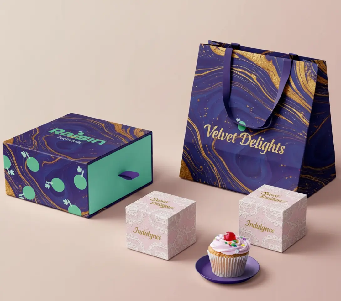
What is luxury packaging design?
Luxury packaging design is engineered so that the act of opening becomes the first product experience. Slow-reveal mechanics, weighted materials, magnetic closures, and tactile finishes compress emotional value into the unboxing moment. Hermès, Tiffany, and Apple set the modern reference.
Luxury packaging is not just expensive packaging. It is packaging where every sensory detail is engineered: the weight of the lid, the friction of the slide, the sound of the closure, the tactile finish of the substrate.
Five mechanisms appear in most luxury packaging:
- Weighted substrates: rigid board at 800–1500 GSM, sometimes with internal weighting, gives the package a substantial feel.
- Magnetic closure: the click of a magnetic flap signals quality more reliably than a tuck flap.
- Layered reveal: opening the package happens in two or three stages, not one. Outer sleeve, inner box, tissue, product.
- Tactile finishing: soft-touch lamination, satin ribbon, satin lining, and texture-rich substrates engage touch.
- Print restraint: most luxury packaging uses minimal print and high-finish techniques—foil stamping, blind emboss, edge painting—rather than heavy graphics.
Luxury packaging fits high-margin categories where the unboxing is part of the gift or self-purchase ritual: jewelry, premium cosmetics, electronics, spirits, gifts. See our luxury rigid box manufacturing for the production options.
What design principles apply to every packaging style?
Five design principles apply across every aesthetic style and strategic framework: the three-second shelf rule, visual hierarchy from logo to compliance, the primary display panel layout, the two-typeface system, and color palette discipline of two to three colors maximum.
These principles are not style choices. They are physics. They apply whether the brand is minimalist or maximalist, retail or DTC.
What is the three-second rule in packaging design?
The three-second rule states that a consumer decides whether to engage with a package within three seconds of seeing it. The package must answer two questions in that window: what is this product, and is it for me. Packages that fail this test lose the consumer to a neighbor.
The rule shapes every layout decision. The product name, category descriptor, and key claim must be readable instantly. Detail belongs on the back, not the front.
What is visual hierarchy in packaging?
Visual hierarchy is the deliberate ordering of design elements by importance, so the consumer’s eye reads them in the intended sequence. The standard order is logo first, product type second, key claim third, supporting information fourth, and compliance information last.
Hierarchy is enforced through size, color contrast, position, and white space. The largest, highest-contrast element is read first.
What is the primary display panel?
The primary display panel, or PDP, is the surface of the package that faces the consumer in its main use context. On a retail shelf, the PDP is the front face. In an e-commerce thumbnail, the PDP is whichever side the brand chooses to photograph. PDP design carries 60–70% of the brand impression.
For multi-channel brands, the PDP is not always the same face. A bottle that sits on a shelf may show its front; the same bottle photographed for an Amazon listing may show its label flat. Design both views.
How many colors should packaging use?
Packaging should use two to three core colors plus one accent color, for a maximum of four colors visible at once. More colors dilute brand recognition and complicate print production. Fewer than two reads as undesigned.
Pantone matching is recommended for brand-critical colors because CMYK conversion produces variation across print runs. The cost of Pantone is small compared to the cost of inconsistent brand color.
How should typography work on packaging?
Packaging typography should use a two-typeface system: one display typeface for the brand name and key claims, and one body typeface for ingredients, instructions, and compliance text. A third typeface introduces noise without adding hierarchy.
The display typeface carries personality. The body typeface must be legible at small sizes—8 point minimum for required information. Multilingual packaging needs both typefaces to support all target scripts.
How do you choose the right packaging design approach?
Choosing a packaging design approach requires answering three questions in order: where will the consumer first see the product, what visual saturation does the target audience prefer, and do those two choices reinforce each other or conflict.
The first question picks the strategic framework. The second picks the aesthetic style. The third tests whether the combination works.
The two tables below map common combinations.
Style × Category Fit
| Style | Cosmetics | Food | Spirits | Apparel | Tech | Subscription |
| Minimalist | Strong | OK | Strong | Strong | Strong | OK |
| Maximalist | OK | Strong | Strong | Weak | Weak | Strong |
| Bold Minimalism | Strong | Strong | Strong | OK | Strong | Strong |
| Retro/Vintage | Weak | Strong | Strong | OK | Weak | OK |
| Retro-Futurism | Strong | Strong | OK | OK | OK | Strong |
| Hand-Drawn | OK | Strong | OK | Strong | Weak | Strong |
| Biophilic | Strong | Strong | OK | OK | Weak | OK |
| Typography-Driven | OK | Strong | Strong | OK | OK | OK |
| Transparent | OK | Strong | Strong | Weak | Weak | OK |
Strategy × Channel Match
| Framework | Main Channel | Core Constraint |
| DTC | E-commerce, brand site | Shipping survival, unboxing moment |
| FFP/SIPP | Amazon FBA | 120-second open, SIOC, 100% recyclable |
| Retail-Shelf | Sephora, Whole Foods, Target | 3-second rule, hang tab, SKU clarity |
| Subscription | Bokksu, Birchbox, FabFitFun | Ritualization, collectability |
| Luxury | High-margin gift and self-purchase | Slow reveal, weight, finish density |
If a chosen style and chosen framework conflict—for example, intricate hand-drawn maximalism inside a frustration-free package—one of them needs to bend.
How do design choices translate to manufacturing specifications?
Every aesthetic style implies a specific stack of paper grade, GSM, finishing techniques, and printing methods. Minimalism implies SBS with soft-touch lamination. Maximalism implies multi-color offset with spot UV. Luxury implies rigid board with foil and embossing.
The table below maps each style to its typical production stack.
| Style | Typical Material | Typical Finishing | Typical GSM |
| Minimalist | SBS white board | Soft-touch lamination, subtle deboss | 350–500 |
| Maximalist | C1S or CCNB | Multi-color offset, spot UV, foil | 300–450 |
| Bold Minimalism | SBS white board | Vibrant Pantone, matte lamination | 350–500 |
| Retro/Vintage | Kraft or uncoated | Single-color print, deboss | 300–450 |
| Hand-Drawn | Kraft or recycled | Digital print, uncoated | 250–350 |
| Biophilic | Bagasse, kraft, FSC | Soy ink, no lamination | 250–450 |
| Luxury (any aesthetic) | Rigid board | Foil, emboss, satin lining | 800–1500 |
These are starting points. The actual specs depend on product weight, structural requirements, and order volume.
For the full production process—from dieline preparation to MOQ planning—see how to bespoke custom packaging from style brief to mass production. For the science behind paper weight choices, see our GSM paper weight guide.
What compliance rules constrain packaging design?
Packaging design must comply with regional labeling rules including FDA requirements for food and cosmetics, CE marking in the EU, California Proposition 65 warnings, CPSIA for children’s products, and recyclability symbols specific to each market. Compliance overrides aesthetic preference.
Each market imposes its own rules:
- United States: FDA requirements for food, drug, and cosmetic labeling. California Proposition 65 warnings for products containing listed chemicals. CPSIA for children’s products under 12.
- European Union: CE marking for many product categories. Allergen disclosure rules. Producer responsibility for recyclability.
- Recyclability symbols: each region uses different icons. The Mobius loop, On-Pack Recycling Label (UK), Triman (France), and Green Dot all have specific rules.
- Multilingual requirements: products sold in Canada need French. Products in the EU often need three to five languages on the same package.
These rules consume real space on the package. A designer who ignores them until the end will redesign at the end. Designers who account for them from the beginning produce stronger, calmer layouts.
Frequently Asked Questions
What’s the difference between DTC packaging and retail packaging?
Retail packaging is designed to win attention from two meters away on a crowded shelf in three seconds. DTC packaging is designed for the unboxing moment—a private, often photographed first experience after shipping. Retail packaging emphasizes large SKU labels and hang features. DTC packaging emphasizes inner branding, inserts, and tactile materials.
What is frustration-free packaging?
Frustration-free packaging is Amazon’s certification framework, now expanded as Ships in Product Packaging. It requires packaging that opens within 120 seconds without tools, uses 100% recyclable materials, and ships in its own container. There are three tiers: FFP, SIOC, and PFP. Non-compliance triggers a $1.99 per-unit chargeback for FBA sellers.
Is minimalist packaging cheaper to produce than maximalist?
Not always. Minimalist packaging often relies on premium materials—high-GSM SBS, soft-touch lamination, subtle foil—to compensate for the absence of decoration. Cost shifts from print to substrate and finish. Maximalist packaging spreads cost across multi-color print, spot UV, and special inks. Both can be premium-priced.
What design style works best for Gen Z consumers?
Gen Z consumers respond strongly to retro-futurism (Poppi, Olipop), maximalism (Couplet Coffee, Omsom), bold minimalism (Liquid Death, Recess), and hand-drawn aesthetics. The common thread is high social-media shareability, a clear point of view, and rejection of corporate-polished design. Generic minimalism reads as “millennial brand from 2018.”
How do I design packaging for both retail and e-commerce?
Design two versions, not one compromise. Retail needs shelf impact at two meters. E-commerce needs unboxing engagement and shipping survival. Many brands use a unified visual system across both, but adjust structure—a retail folding carton becomes an e-commerce mailer with internal branding—rather than forcing one package to serve both jobs.
What is the unboxing experience in packaging design?
The unboxing experience is the choreographed sequence a consumer goes through when opening a package, from first touch to product reveal. It includes opening mechanics, layered reveal, tactile finishes, inserts, and final product presentation. Strong unboxing experiences increase social media sharing and customer retention.
How long does packaging design take from brief to production?
Typical timelines run eight to twelve weeks total: design and approval take five to ten days, structural samples take one to seven days, finished samples take three to five days, and production takes 15–20 days for orders under 50,000 units. Sea shipping adds 20–30 days. See our bespoke packaging guide for the full timeline.
What style should sustainable brands use?
Biophilic and minimalist styles align most naturally with sustainability positioning, but the style alone is not enough. Consumers now recognize greenwashing. The visual aesthetic must match the actual material choices: FSC-certified paper, soy ink, no lamination, recyclable construction. Style and substance must match.
Can a brand use both minimalist and maximalist styles?
Yes, when the styles serve different products in the brand’s range. A core product line might use minimalism, while seasonal or limited-edition products use maximalism. The brand identity—logo, typography, color core—stays consistent across both. The styles signal different purposes within one brand.
What information must legally appear on packaging?
Required information varies by product category and market, but typically includes product name, net weight or volume, ingredients or contents, manufacturer name and address, country of origin, expiration or use-by dates, allergen warnings, and recyclability symbols. Children’s products, food, drugs, and cosmetics have additional requirements.
Where to go next in your packaging design journey
After choosing your packaging design approach, the next step is bespoke production—translating your style and framework into materials, GSM, finishing, and dielines. WITPAX provides design consultation, prototyping within five days, and production at MOQs from 500 units.
Your next steps:
- Ready to translate your style into specs? See how to bespoke custom packaging for the full production process.
- Need a luxury rigid box? Browse our luxury rigid box options with magnetic closure and foil stamping.
- Choosing a folding carton structure? See our custom folding carton packaging.
- Building a sustainable brand? Review our FSC-certified sustainable packaging materials.
- Need help picking GSM? See our paper weight selection guide.
- Want a quote for your project? Request a quote within 24 hours.